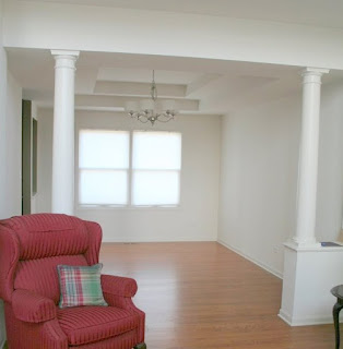
Martie & Greg were in a tough spot with their Dining Room and Living Room. With the rest of the house complete, they just couldn't make these two spaces work.
With a new view on style, it was hard to meld their more contemporary new view (see light fixture,) with the old school (old house,) pieces in the living room.
They too struggled with choosing a paint color and what to do with those windows.
We 1st picked out a new paint palette using the rest of the completed home as our guide, we choose rich toffees and herbal greens. We then addressed that living room, and decided to keep the tables but replace the couch and side chair. The large red recliner moved to the master, as well as the side chair. She had just purchased a dining room table and 2 black parsons chairs. We did a search within the home and found a lovely mirror and an additional, more scale suited chair in the master.
The side chair, although wonderful in scale, didn't have wonderful fabric on it. As we discussed window treatment ideas, Martie excitedly said she had some fabric yardage she bought and just didn't know what to do with. Ironically, when she pulled it out, stunningly the colors were the same I had chosen for her paint palette.
With a plan in progression, I suggested she have the chair reinvented, with the floral motif fabric. To keep the more clean lines of her new style, she should have silver nail heads added to the chair. The other fabric was a stripe, which I then drew a plan for the window treatments, gave her a shopping list for furniture, accessories and additional fabric yardage for window treatments - And here are the results.
So with a little bit of reinvention, some wise shopping, fabulous color and innovated window treatments, their living room and dining room went from barely livable, to rich, welcoming and a total reflection of Martie & Greg!


3 comments:
This is beautiful! I love those colors...toffee and herbal green...so peaceful! Hoping to make it to the event on 5/26 at Misty Ridge. Just checking to be sure it's ok to show up, even if I'm not a realtor?
Looks fabulous Julea!! Pretty architecture in the rooms too!!
Trish, Sure please join us!
Post a Comment